Set the period
Choose a time range for the market data review.
A terminal for comparing market series and examining a selected moment. Charts, indicator selection and source details share one analytical workspace.
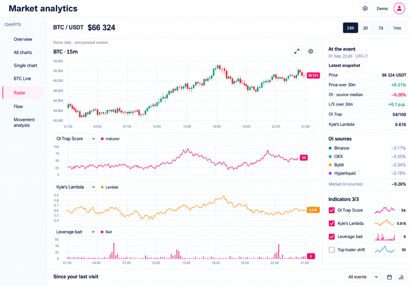
Make several data streams clear on one screen: price, indicators, sources and the selected point in time.
Price and indicators describe different aspects of the market. The interface needs to help users compare them over time and see which values and sources belong to a selected observation. The chart layout and detail panel are organised around that task.
Choose a time range for the market data review.
Configure the panels and metrics used for the analysis.
Examine an event and the values associated with its point in time.
Compare price, indicators, sources and data quality information.
The candlestick chart anchors the upper work area, with separate indicator panels underneath. This hierarchy provides a reference for reading several time series. In the updated demonstration mockup, each panel has its own name, colour and value scale so different metrics remain identifiable.
A detail panel collects values at the event time and information about their sources. It connects a visual observation with a specific set of metrics. Source comparison and data quality are part of the product scope; the updated mockup illustrates that context with synthetic values.
Time range and metric selection allow the workspace to suit a particular analysis. Indicators occupy separate panels and their selection list stays nearby. The main flow follows a clear sequence: set the period, choose the metrics, then examine an event and the data behind it.
The candlestick chart sits above three indicator panels. Labels, colours and separate scales distinguish their roles. This updated English demonstration mockup uses synthetic charts and values.
The right panel of the same mockup shows event-time values, OI sources and indicator selection. It illustrates the information structure; it is not a real trading session or evidence of predictive accuracy.
Implemented an analytics interface with charts, time range and metric selection, observation details and source comparison. The portfolio uses the updated analytics-v2 demonstration mockup with synthetic series and makes no trading performance claims.
Discuss a similar projectUseful for analytics and monitoring tools where multiple time series need event details and visibility into data sources.
Project under NDA. The domain and project name are hidden. The portfolio demonstrates interface development, not strategy returns.
 Next case studyPnlee. From signal to position.